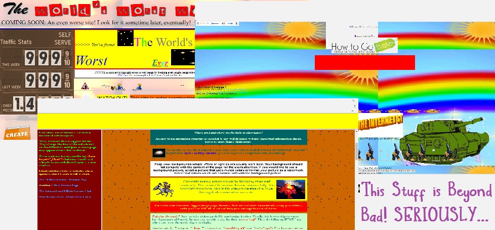
I saw a blog post recently where someone was asking people, “What’s the ugliest website you guys have ever seen?”
Curiosity piqued, I decided to check the various answers – and a lot of people had an opinion on this.
Visiting a few of the sites made me chuckle in some ways, but made me realize something that clients don’t always seem to fully understand: that the overall look and feel of a site is more important than one might think.
Think about a bricks & mortar establishment. For example, consider a typical gas station.
I travel quite a bit, and therefore frequently find myself in service stations. Usually I’ll go gas up, use the restroom, grab a cup of coffee, and be on my way.
Sometimes, if faced with a choice of stations, I will opt for the cleaner and brighter premises, even if it means paying one or two cents more per gallon at the pump.
Why is that?
Because experience has taught me that dirty-looking or dingy buildings and grounds mean less than sanitary restrooms, old coffee, and no half & half to put in it. (Half & Half is important to me. I judge a lot of places on whether or not they actually offer real half & half, or if they cheap out and just put out powdered garbage that no human being should be ingesting anyway. But that’s another story.)
Laziness and cheapness practically ooze from every inch of places like that. I’m left with a feeling that the owners or management don’t care about their customers, and I don’t want to give them my business.

Why would a website’s appearance be much different?
Would you rather have a meal in a dirty, greasy restaurant, or in a bright and clean one (remember, we are talking about first impressions here)?
Think of your website in the same way.
I’m not saying that your site has to have a bunch of bells and whistles, but it does need to be welcoming to your prospective client or customer, and it does need to show that you care about them.
If your website isn’t clean, easy to read, and user friendly, your visitor is going to click away immediately.
If your text isn’t error-free, and if your pages aren’t fast-loading, believe me: your visitors won’t have the patience to stick around and allow you to sell or offer them squat.
So what is the answer? If you aren’t a web designer, and only know that you have some good stuff to offer your visitors, what do you do?
Here is the answer: You allow someone who DOES know what to do the opportunity to work with you to get your site designed and populated with the correct text, and the best layout for offering your services.
In other words, you PAY someone who knows what they are doing. If Uncle Bob offers to do it for you for free, but his only experience in such matters is loading some photos into his company’s website at work, you might want to think twice.
Even though I’m a person who works on people’s websites for money (yeah, that’s right, I’m in this because it pays the bills, and I know what to do), there are benefits to working with someone like me.
One of the benefits is that if Uncle Bob is going to do your site for free, and it turns out you don’t like it, hanging out together at the holiday dinners is going to become strained and awkward.
Or, if you insist on letting Uncle Bob do your site, and then you’re bummed out about how it comes out, that’s fine too. I’ll be here, and you can just pay me to fix it.
If you don’t like what I’m doing, or you want to change stuff around, we get together and come up with a plan and move forward. No awkward dinners need happen.
Ready to call yet? Ok! Great! Like I said earlier, I’m waiting patiently for you to be in touch. See you soon!

